A Protocol for Data Exploration
1 Introduction
Undertaking a systematic data exploration prior to applying statistical analysis techniques to experimental data, can help improve the statistical validity of results and associated conclusons. Key to this is a protocol for ensuring the scientist does not discover a false covariate effect (type I error) or mistakenly dismiss a model with valid covariate effects (type II error).
The aim of this first vignette is to provide a protocol for data exploration, the goal of which is to identify potential problems within the data before any in depth statistical modelling is undertaken. The approach outlined makes extensive use of the material discussed in1. Datasets are sourced from the internet or researchers at Oxford Brookes University.
1.1 Data exploration protocol
The data exploration protocol can be summarised as follows:
- Outliers - observations that are relatively large or small when compared to the majority of observations, can significantly affect a statisical result if an unsuitable technique is used.
- Homogeneity of variance - a number of statistical techniques assume homogeneity of variance of data. If this is violated the null hypothesis maybe falsely rejected or the power of the test maybe decrease.
- Normality - if data are not normally distributed, a number of statistical tests may not be valid, and alternative approaches will be required to test the distributon of data.
- Zero-inflation - when modelling species counts, a large proportion of survey data maybe zeros. In such cases alternative statistical models should be used to avoid biased estimates.
- Collinearity - avoiding correlation between independent variables (covariates) is important otherwise statistical significance may not be correctly determined.
- Associations - it maybe important to explore the indicative relationship between response variables and covariates in order to better understand which modelling techniques to adopt.
2 Are there outliers?
Outliers are loosely defined as one or more observations that have a relatively large or small value compared to the majority of observations. A more formal defintion is a point which falls more than 1.5 times the interquartile range above the third quartile or below the first quartile. In order to demonstrate an example of this we will use species group size data observed in the Naboisho Conservancy within Kenya. This data was collected as part of a suvrey work into species abundance within the conservancy, researchers recorded the size of species groups as they drove along a number of 2km transects.
2.1 Boxplots
The boxplot visualizes the median of the data and the spread of the data about it. In the chart below the:
- median is presented as a vertical line within the white box
- 25% and 75% percentiles form a box around the median that contains half of the observations
- ends of the thin line either side of the white box are the upper and lower whiskers
- upper whisker covers values no larger (or smaller) than the interquartile range (the distance between the first and third quartiles)
- data beyond the whiskers are the outliers, and are shown as red dots.
naboisho %>%
  filter(species != "None") %>%
  ggplot(aes(x=species, y=log10(size))) +
  geom_boxplot(outlier.colour="red",
               outlier.shape=16,
               outlier.size=0.75,
               notch=F) +
  coord_flip() +
  ggtitle("Species group sizes in Naboisho Conservancy. 2016 to 2019") +
  xlab("Species") +
  ylab("Species group size (log10)") +
  theme_bw()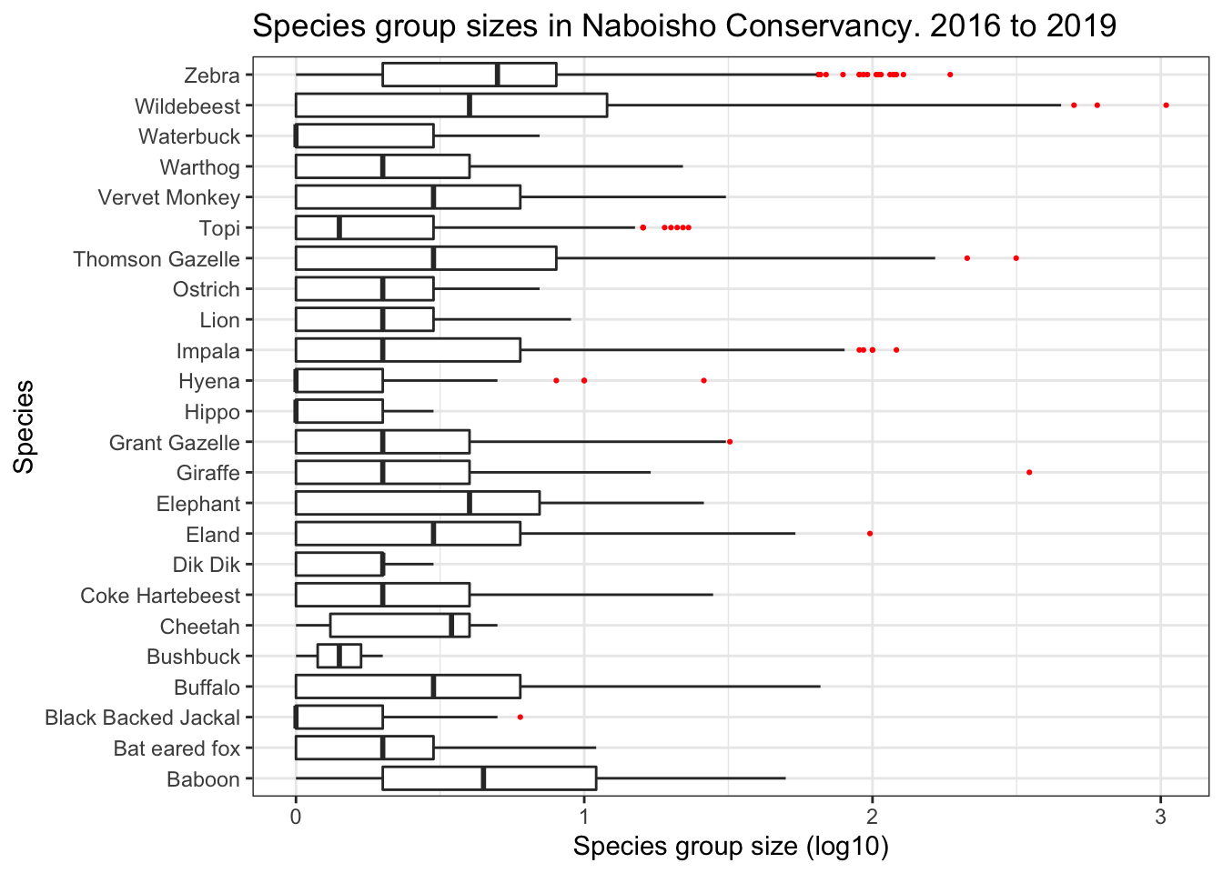
Note the x axis has a scale of log base 10, in order to compare species with small group sizes, such as Black Backed Jackal, against species with large group sizes such as Zebra or Wildebeest.
2.2 Cleveland dot plot
The Cleveland dotplot is a chart in which the row number of an observation is plotted versus the observation variable, thereby providing a more detailed view of individual observations than a boxplot. Points that stick out on the right-hand side, or on the left-hand side, are observed values that are considerably larger, or smaller, than the majority of the observations. The chart below shows a dot plot for each species within the Naboisho dataset from 2016 to 2019.
naboisho %>%
  # Remove species with no name
  filter(species != "None") %>%
  # Order data by observation position in the data set
  ggplot(aes(x=size, y=seq(1, length(size)))) +
  # Make the chart points transparent
  geom_point(alpha=0.3) +
  ggtitle("Cleveland dot plot of Naboisho species 2016 to 2019") +
  labs(x = "Observed group size of Species",
       y = "Order of data") +
  theme_bw() +
  # Plot for each species
  facet_wrap(~species, ncol = 3, scales = "free_x")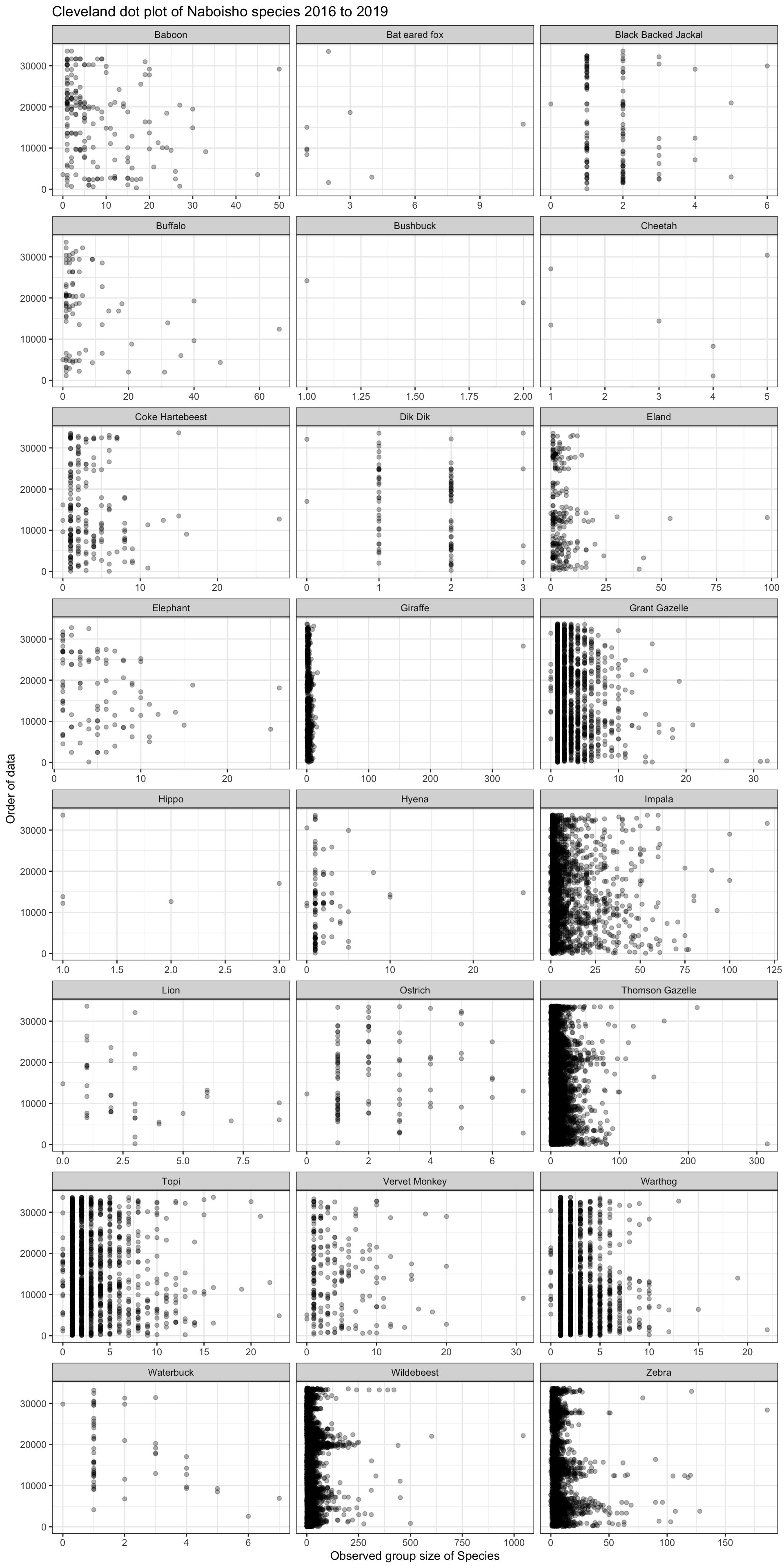
We can see that Giraffe has a single outlier; a group size of around 350 Giraffe. This is quite clearly a data entry error and not typical Giraffe herding behaviour. If we remove this outlier and replot the dot plot, we see the following for Giraffe:
naboisho %>%
  # Only plot Giraffe
  filter(species == "Giraffe") %>%
  # Remove the outlier
  filter(size <= 300) %>%
  ggplot(aes(x=size, y=seq(1, length(size)))) +
  geom_point(alpha=0.3) +
  ggtitle("Cleveland dot plot of Giraffe Naboisho 2016 to 2019 - outliers removed") +
  labs(x = "Observed group size of Giraffe",
       y = "Order of data") +
  theme_bw()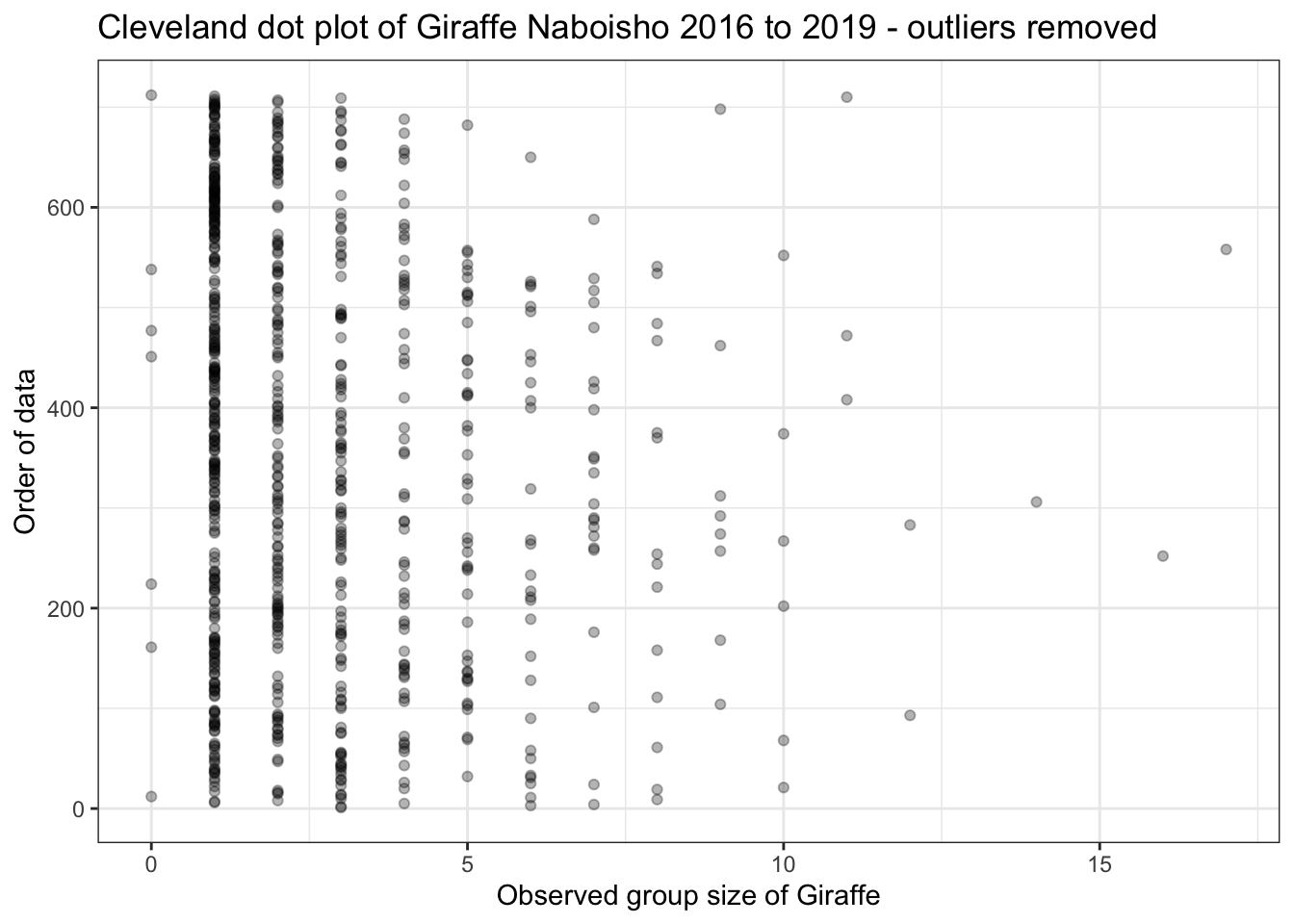
Nowe can see that Giraffe group sies are never more than 20 animals, which is what we might expect based on the literature. Note we also have a number of observations with a group size of zero. This is clearly not possible and is probably due to how the data is recorded by the observer. We can correct this accordingly:
# Replaces zeros with ones
naboisho <- naboisho %>%
  mutate_all(funs(replace(., size == 0, 1)))
2.3 Implications
Having determined that there are outliers in the observation data, we can take a number of steps to validate their inclusion or not:
- check the data to ensure that there has not been a data entry error
- check the scientific literature to give an indication of what we might typically expect
- generate a number of observations randomly from an appropriate distribution (known as boot-strapping), and determine how the proportion of extreme points compares to the field data
If the outliers are deemed valid then it maybe necessary to only use statistical methods that can handle over-dispersed data. For example, Poisson or negative-binomial distributions for count data, or zero-inflated models.
3 Homogeneity of variance
Homogeneity of variance is an important assumption that must be checked prior to performing analysis of variance (ANOVA). The plot below shows a boxplot for Wildebesst group size observations within the Naboisho dataset. In the plots below we have assumed that the long rains are from April to May, the short rains are in November and all other months are considered to be in the dry season.
To apply ANOVA to these data to determine if mean Wildebeest group size varies by year, season or a combination of year and season, we must assume that variance:
- within years are similar
- within seasons are similar
- between seasons, within years are similar.
# Add a column to the data set to determine month of year

naboisho <- naboisho %>%
  mutate(Month = lubridate::month(as.Date(Date), label= T, abbr = T)) %>%
  # Add a season column to data
  mutate(season = case_when(
    Month == "Apr" ~ "long rains",           #long rains
    Month == "May" ~ "long rains",           #long rains
    Month == "Nov" ~ "short rains",           #short rains
    TRUE           ~ "dry")) # Else it's the dry season

wildebeest_seasons <- naboisho %>%
  # Take Widebeest only, and remove outliers for group size > 500
  filter(species == "Wildebeest", size < 500) %>%
  # Filter out 2016 as insufficient data to determine month
  filter(year != 2016)

wildebeest_seasons %>%
  # Plot boxplots by season, don't display outliers
  ggplot(aes(x=season, y=size)) +
    geom_boxplot(outlier.shape=NA) +
    # Facet by year
    facet_wrap(. ~ year) +
    coord_cartesian(ylim=c(0, 90)) +
    theme_bw() +
    ggtitle("Boxplot of Wildebeest group size by season, across years (no outliers)") +
    labs(x = "Season and year",
         y = "Observed group size of Wildebeest")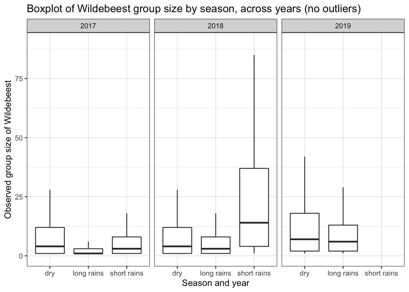
We can see that the variance between seasons within a year is significantly different for 2017 and 2019. Therefore we should not undertake the classic ANOVA test if we want to analyse differences in group means within the years 2017 and 2019. Also we have more than two groups and because the size data are counts, we should not assume they are normally distributed.
3.1 Levenne’s homogenrity of variance test
We can directly test for homogeneity of variance of non-parametric data by using Levenne’s test:
library(car)

# Generate a two-way test to incorporate interaction between seasons and years
leveneTest(size ~ as.factor(season) * as.factor(year), data = wildebeest_seasons)
## Levene's Test for Homogeneity of Variance (center = median)
## Df F value Pr(>F)
## group 7 24.722 < 2.2e-16 ***
## 9744
## ---
## Signif. codes: 0 '***' 0.001 '**' 0.01 '*' 0.05 '.' 0.1 ' ' 1From the output above we can see that the p-value is much less than the significance level of 0.05. This means that we should not assume equal variance for interaction between years and seasons.
We therefore need to use a test that does not assume equal variance, can work for three different groups and is non-parametric. The Kruskal-Wallis test is a non-parametric test, and is used when the variance assumptions of ANOVA cannot be met. The test can assess for significant differences in a continuous response variable (in our case, group size) by two or more categorical independent variable groups (in our case the three different seasons). With this test we can ask the question if the mean group size between long rains, short rains and dry seasons is statistically different within a given year.
# Select 2017 wildebeest observations only
wildebeest_seasons %>% filter(year == 2017) %>%
  # Test for significance of means of size by season
  kruskal.test(.$size, .$season, data = .)
##
## Kruskal-Wallis rank sum test
##
## data: .$size and .$season
## Kruskal-Wallis chi-squared = 292.62, df = 2, p-value < 2.2e-16As p << 0.05, we can therefore reject the null hypothesis that the difference in mean values are zero. So the mean group size does vary by season in 2017. But between which groups is the differnce most significant? To answer this we need a post-hoc test, and for this we use a pairwise wilcox test.
wildebeest_seasons %>% filter(year == 2017) %>%
  pairwise.wilcox.test(.$size, .$season, data=.)
##
## Pairwise comparisons using Wilcoxon rank sum test
##
## data: .$size and .$season
##
## dry long rains
## long rains <2e-16 -
## short rains 0.025 <2e-16
##
## P value adjustment method: holmThe results show us that the least significant differnce in 2017 was between the dry and short rains seasons, as confirmed by the boxplots above. We can apply the Kruskal-Wallis test across the entire naboisho dataset. This time we’ll test if year-on-year mean group size changes are significant.
# Apply Kruskal-Wallis to each species to see if change in mean year on year is significant

species_kw_test <- naboisho %>%
  # Filter species recorded as None
  filter(species != "None") %>%
  # Count testable data
  count(species, year) %>%
  # Remove any data less with a count less than 10
  filter(n>10) %>%
  # Create testable data set
  left_join(naboisho) %>%
  # Nest each species group
  nest(-species) %>%
  # Map each group to the Kruskal test
  mutate(kruskal_res = map(data, ~ kruskal.test(.x$size, .x$year)),
         kruskal     = map(kruskal_res, broom::tidy)) %>%
  # We dont needed the nested data frames anymore
  dplyr::select(-data) %>%
  # Unnest the result
  unnest(kruskal)

# Select species where we cannot reject the null-hypothesis
species_kw_test %>%
  filter(.$p.value > 0.05)
## # A tibble: 10 x 6
## species kruskal_res statistic p.value parameter method
## <fct> <list> <dbl> <dbl> <int> <chr>
## 1 Black Backed Jackal <htest> 4.89 0.0869 2 Kruskal-Wallis rank sum test
## 2 Buffalo <htest> 3.88 0.144 2 Kruskal-Wallis rank sum test
## 3 Coke Hartebeest <htest> 0.501 0.778 2 Kruskal-Wallis rank sum test
## 4 Dik Dik <htest> 4.00 0.136 2 Kruskal-Wallis rank sum test
## 5 Elephant <htest> 5.63 0.0598 2 Kruskal-Wallis rank sum test
## 6 Lion <htest> 2.25 0.134 1 Kruskal-Wallis rank sum test
## 7 Ostrich <htest> 0.857 0.652 2 Kruskal-Wallis rank sum test
## 8 Topi <htest> 5.39 0.145 3 Kruskal-Wallis rank sum test
## 9 Vervet Monkey <htest> 1.20 0.548 2 Kruskal-Wallis rank sum test
## 10 Waterbuck <htest> 0.353 0.552 1 Kruskal-Wallis rank sum testThe table above lists the species where we should not infer statistical significance from year-on-year mean group size changes.
3.2 Implications
Linear regression is an example of a well used modelling technique in ecology that assumes homogenous variance across data. This can be checked by plotting the model residuals against the fitted values. A good fit will have have similar residual variation across all values. In order to address heterogeneity of variance in the response variable, it is possible to transform it; for example via a log transformation. Alternatively, modelling approaches that do not assume equal variance can be used.
4 Normality
A significant number of statistical modelling techniques assume that data are normally distributed. For example, linear regression. So what techniques are typically used to observe or test for normality in our data?
4.1 Histogram
Here we use weight data for a set of 1,193 sparrows (see Zuur). We use the data in order to assess normality, starting with a simple historgram.
# Load sparrows data set
sparrows <- read.delim("/Users/anthony/Documents/GitHub/ComputationalEcology/data_analysis_files/Sparrows.txt")

# Use ggplot's histogram geom to plot
ggplot(sparrows, aes(x = wt)) +
  # Set the histogram binwidth to 0.25g
  geom_histogram(color = "black", binwidth = 0.25) +
    theme_minimal() +
  labs(x = "Weight (g)", y = "Frequency") +
  ggtitle("Histogram of sparrow weights")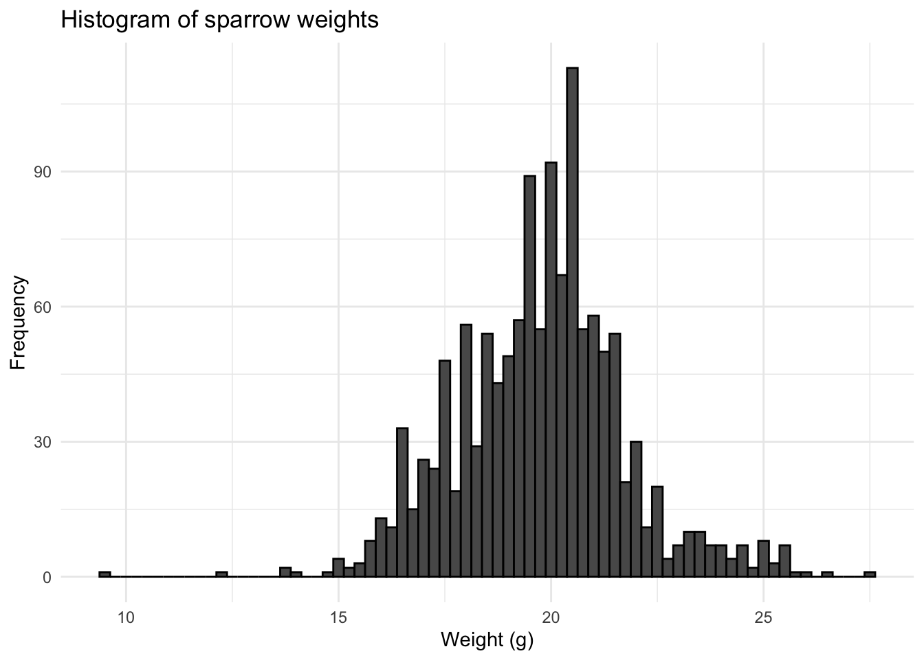
We can see that the data are approximately a bell-shape or normal distribution. Histograms are a useful why to quickly check how the data are distributed.
4.2 Density plot
Whilst the histogram appears to have an approximate normal shape, we can look at a density plot in order to obtain a smoother plot of the data distribution, that has a normalised scale on the y-axis.
library(ggpubr)
ggdensity(data = sparrows$wt,
          main = "Density plot of sparrow weight",
xlab = "Sparrow weight") 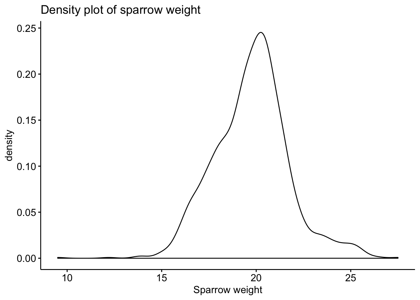
4.3 Q-Q Plot
The Q-Q plot is yet another alternative method of assessing normality. The chart below plots the sparrow sample data against a theoretical normal distribution. The points should lie as close to the line as possible, with no obvious pattern away from the line, for the data to be considered normally distributed.
ggqqplot(sparrows$wt)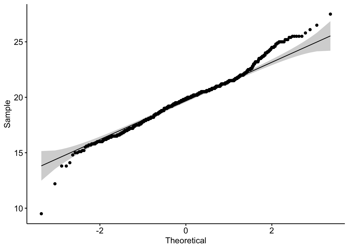
We can see that the Q-Q plot departs from the theoretical line at extremes. This is because the distribution has long tails; the degree of which is known as kurtosis. However, if we subset the data by month and plot a sparrow weight histogram for each month, we can see how the data varies considerably month-on-month throughout the year.
# Add a month column so that we can plot data by month
sparrows %>%
  mutate(Month = lubridate::month(Month, abbr = T, label = T)) %>%
ggplot(aes(x = wt)) +
  geom_histogram(color = "black", binwidth = 0.25) +
  theme_minimal() +
  labs(x = "Weight (g)", y = "Frequency") +
  facet_wrap(. ~ Month) +
  ggtitle("Sparrow weight histograms by month")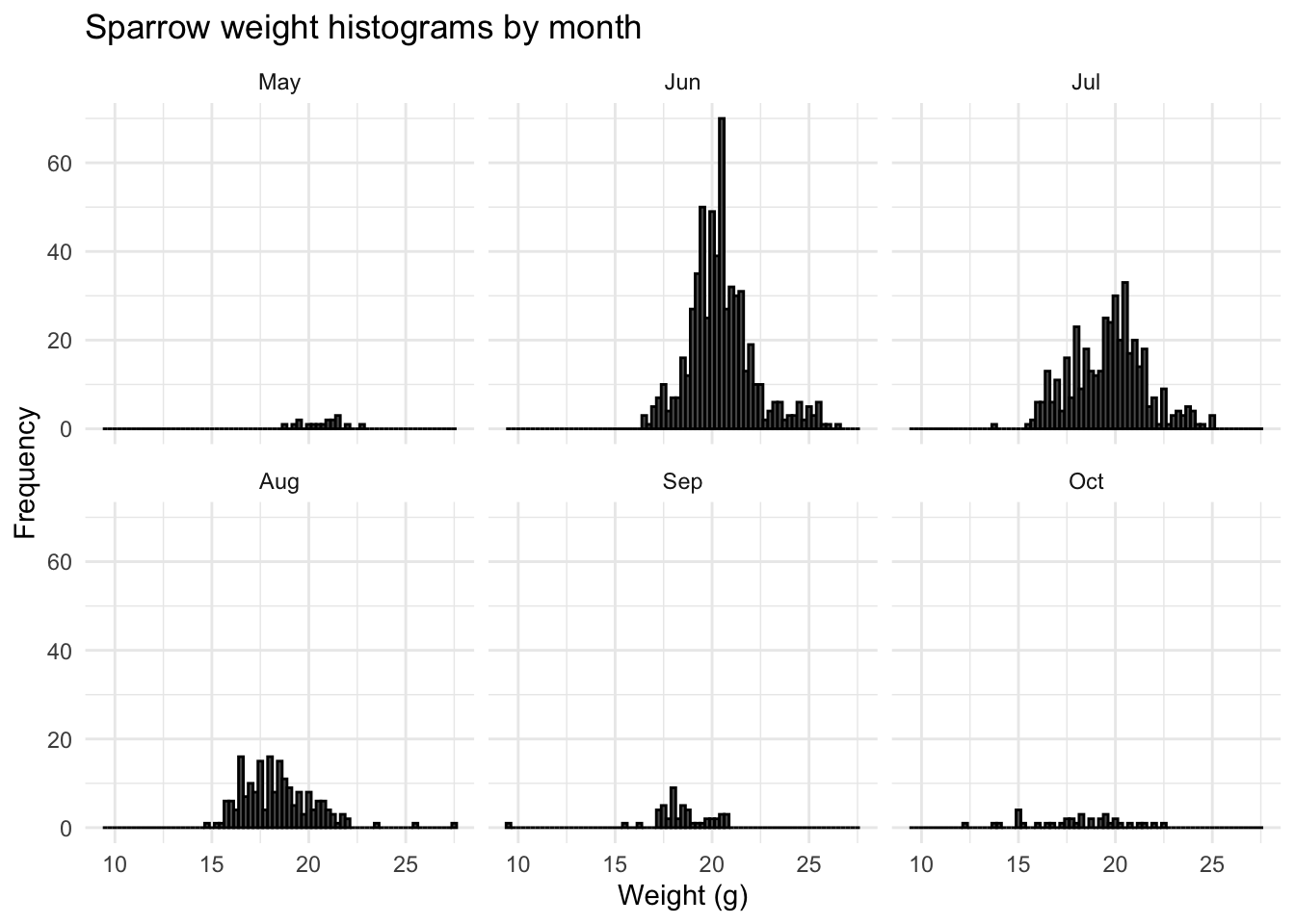
This monthly variance is most likely due to sampling bias; there are more sparrows caught and weighed during the height of summer, when food is more plentiful. If we plot a historgram of the month the observation was recorded, we do indeed see a skew towards summer months:
sparrows %>%
  mutate(Month = lubridate::month(Month, abbr = T, label = T)) %>%
  ggplot(aes(Month)) +
    geom_histogram(stat="count") +
    theme_minimal() +
    ggtitle("Sparrow sample count by month")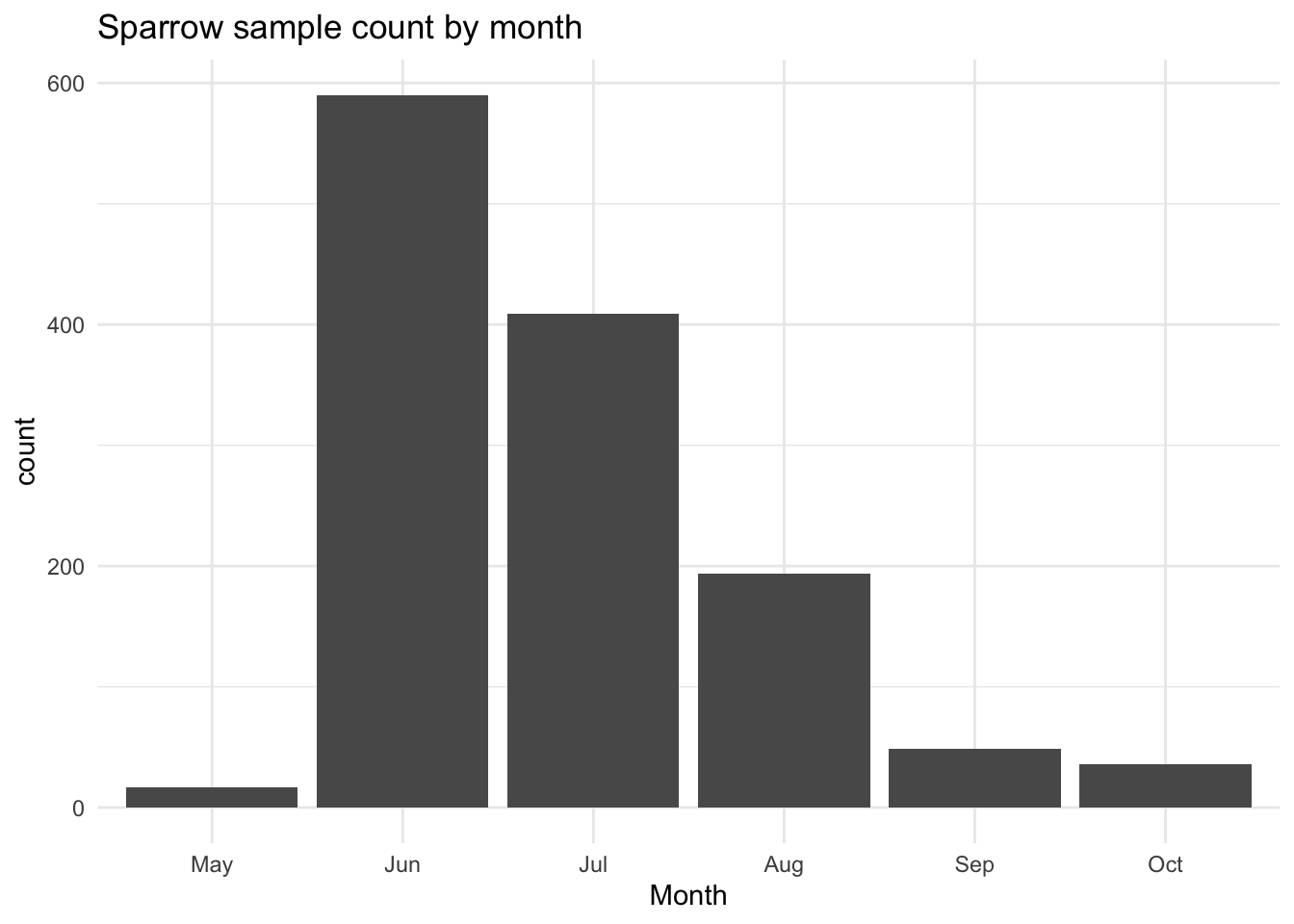
So viewing the data annually gave an over simplistic picture of what was occuring to the weight of sampled sparrows. Whilst their weights are normally distributed in the summer, they appear to follow a different type of distribution outside of the summer months, possibly due to a lack of sample data.
4.4 Implications
If tests suggest that the data are not normally distributed it may be possible to log transform (or take the square root) of the response variable and then repeat the normality checks. If we need to undertake further tests that are depednent on normality, for example ANOVA, then we can use non parametric tests such as the Kruskal-Wallis test in order to test for statistical differences.
5 Zero inflation
When surveying species populations ecologists will often record species count data, and then seek to study how species abundance varies as a function of covariates such as time, habitat type, temperature, weather etc. If species are not observed during a survey, this is recorded as an absence. This can lead to over-dispersion (long tails) of the count data.
This being the case we should proceed with modelling techniques that are based on a zero-inflated probability distribution. Such distributions allow for more frequent zero-valued observations (absences). One approach is to use a zero-inflated Poisson (ZIP) model, or a zero-inflated negative binomial (ZINB) model.
In order to determine the number of zeros within a dataset, we can simply plot a histogram of occurence data. Often within survey data, species absense is implicit in that only a species presence is recorded. If this is the case then the first thing we should do is record the absence explicitly. In this way, we have a true record of the sampling effort undertaken during a survey. If we look at the species data for Giraffe from the Naboisho data set:
# Number of distinct transects undertaken
naboisho %>%
  distinct(Date,Sample.Label) %>%
  count()
## # A tibble: 1 x 1
## n
## <int>
## 1 1099# Number of transects where Giraffe were recorded
naboisho %>%
filter(species == "Giraffe") %>%
distinct(Date, Sample.Label) %>%
count()## # A tibble: 1 x 1
## n
## <int>
## 1 361# Plot a histograme of observation sizes
naboisho %>%
filter(species == "Giraffe", size < 300) %>%
ggplot(aes(x = size)) +
geom_histogram(color = "black", binwidth = 1) +
theme_minimal() +
labs(x = "Giraffe group size", y = "Frequency") +
ggtitle("Histogram of Giraffe group size")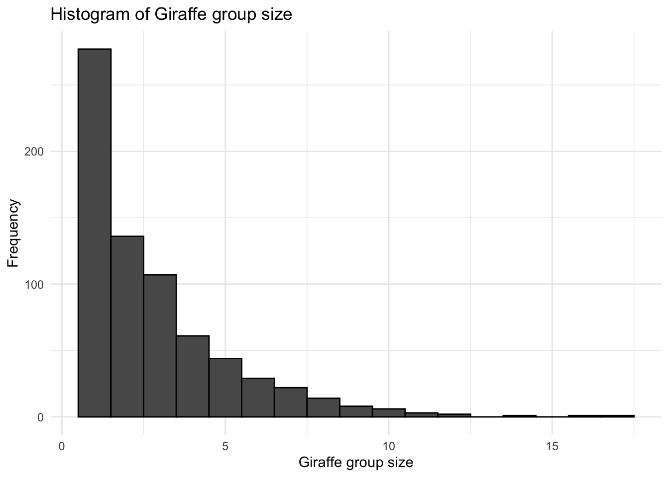
So we see that there were 1099 transects undertaken, but only 361 of them had observtions where Giraffe were present; we have not explicitly recorded the fact that during 738 transects no Giraffe were observed. The histogram shows that the vast majority of observations were just for one Giraffe. So let’s update the data to incorporate this.
# Number of transects where Giraffe were recorded
giraffe_transects <- naboisho %>%
  filter(species == "Giraffe") %>%
  distinct(Sample.Label, Date)

# Select transects where no target species was detected
absence_transects <- naboisho %>%
  distinct(Sample.Label, Date) %>%
  anti_join(., giraffe_transects, copy = T) %>%
  semi_join(naboisho, ., by=c("Sample.Label","Date"), copy=T) %>%
  group_by(Sample.Label, Date) %>%
  slice(1) %>%
  mutate(Species = "NA",
         distance = NA,
         visit = NA,
         size     = 0) %>%
  as.data.frame()

# Combine missing transects with target species transects
complete_transects <- naboisho %>%
  filter(species == "Giraffe", size <300) %>%
  rbind(absence_transects[,1:17])

# Plot a histogram of observation sizes with absence transects included
complete_transects %>%
  ggplot(aes(x = size)) +
  geom_histogram(color = "black", binwidth = 1) +
    theme_minimal() +
    labs(x = "Giraffe group size",
         y = "Frequency")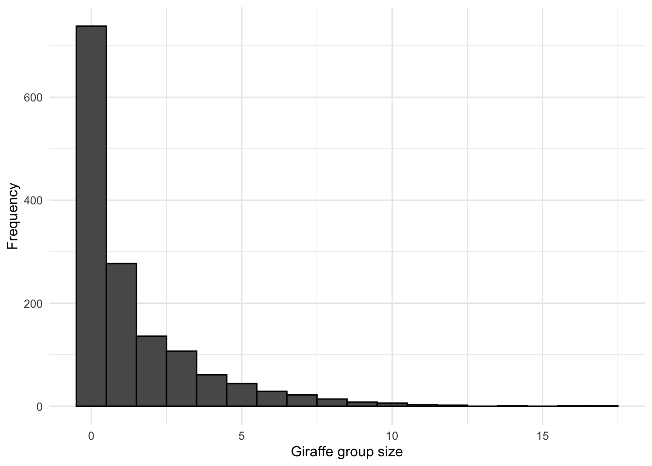
# Check that the number of transects are what we'd expect - 1099
complete_transects %>%
  distinct(Date, Sample.Label) %>%
  count()
## # A tibble: 1 x 1
## n
## <int>
## 1 1099Now we see that by including the transects where Giraffe were not observed (zero-inflating the survey data) the histogram has changed significantly from what it was initially., and we can proceed to employ an appropriate modelling technique (ZIP/ZINB)
5.1 Implications
Often survey data only accounts for presence of a target species, not absence. This often leads to survey data that is over-dispersed. To account for not recording absences, we may have to adjust the data. If we wish to fit a model, we may need to account for zero inflation using zero-inflation models.
6 Collinearity
Collinearity occurs when covariates (the independent variables of a data set) are significantly correlated. This is a problem as collinearity may inflate the variance of modelled regression coefficients, and therefore it is important to detect and remove the redundancy introduced, by removing one of the covariates where the collinearity is observed. Failure to do this will increase standard errors of regression parameters and therefore inflate p-values [1^] when incorporating such data into regression models.
In order to demonstrate collinearity between independent variables, we can look at the doubs dataset2. This dataset records fish species from a survey of the river Doubs in France, together with the spatial coordinates for the 30 survey sites and environmental covariates for each of the survey sites. We can examine collinearity between the environmental covarites from doubs, by using a correlation matrix. This shows scatterplots between covarite variables, together with their Pearson correlation coefficients.
library(PerformanceAnalytics)
library(ade4)

#Let's load the data
data(doubs)
# Data representing water chemistry assay for each site...
env <- doubs$env

# Generate and chart a correlation matrix and bivariate scatter plot
chart.Correlation(env,
                  histogram=TRUE,
                  method = "pearson",
                  pch=19,
                  title = "Correlation Matrix")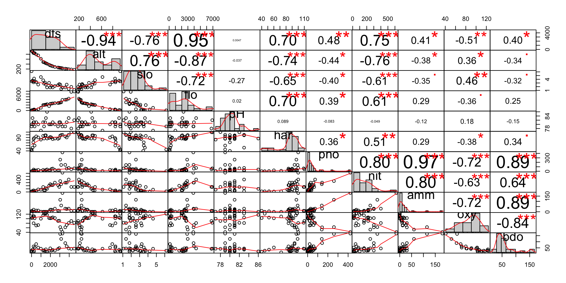
We can easily see that there are a number of covariates with significant (c.90%) absolute correlation between them. The ecological reasons for this correlation are:
Topological environmental covariates:
dfs(distance from source) andalt(altitude) - As we move away from the river source at the top of a mountain, the altitude decreases.dfs(distance from source) andflo(mean flow rate) - again, as we move away from the source, the flow rate of water increases.alt(altitude) andflo(mean flow rate) - as the altitude decreases, again the flow rate typically increases.
Water-chemistry environmental covariates:
pho(phosphate concentrate) andamm(ammonium concentrate) - ammonium is an indicator of organic pollution and phosphorus is a common constituent of agricultural fertilizers, farm animal manure, and organic wastes3. So it would appear likely that their join presence is due to agricultural activities.amm(ammonium concentrate) andbdo(biological oxygen demand) - ammonium and biological oxygen demand are key indicators of organic pollution in water. Bdo shows how much dissolved oxygen is needed for the decomposition of organic matter present in water.pho(phosphate concentrate) andbdo(biological oxygen demand) - high levels of phosphorous in water bodies lead to eutriphication, which is likely to be a direct result of phosphate inputs and ammonium organic waste from farming.
For the covariates pairs outlined above, there is clearly a linear relationship between them. In order to avoid collinearity we need to select the smallest subset of covariates that explains as much of the overall variation in the response variable(s). We will be exploring indpendent variable selection, when fitting regression and machine learning models for species distribution modelling.
6.1 Implications
When assembing covarite data for a regression model, it is important to ensure that covarites that are highly correlated are removed to imrpove the statistical validity of the resulting model. Correlation tests, such as pearsons test can be used to assess this.
7 Associations
Visualising the relationship between the response variable(s) and covariates can help to provide an initial understanding that may aid in the selection of a suitable modelling technique, as well as highlighting observations that do not comply with the general pattern between response and independent variables.
We can show this by using the doubs data set. The plot below shows for each covariate (x axis), how the abundance for each species responds (y axis). A loess smooth has been drawn through the data points in order to more easily show the relationship between covariate and response variables.
library(reshape2)

# select relevant data from doubs dataset
species <- doubs$fish
species$site <- 1:30

environ <- doubs$env
environ$site <- 1:30

# Melt data to get abundance by species
df_melt_species <- melt(species,
                        measure.vars = 1:28,
                        id.vars = "site",
                        value.name = "abundance",
                        variable.name = "species")

# Melt dataframe to give environmental data
df_melt_environ <- melt(environ,
                        measure.vars = 1:11,
                        id.vars = "site",
                        value.name = "cov_value",
                        variable.name = "env_cov")

# Now plot joined data to see response (species abundance) v covariates
# Begin by joining both melted datasets
full_join(df_melt_species,df_melt_environ,"site", keep = F) %>%
  # Remove site as a species
  filter(species != "site") %>%
  # Plot associations
  ggplot() +
  # Plot abundance for against each covariate
  geom_point(aes(x = cov_value, y = abundance), size = 0.5) +
  # Fit a GAM for each plot and plot a smooth
  stat_smooth(aes( x = cov_value,
                   y = abundance),
              # Plot a loess smooth through the data
              method = stats::loess,
              # Switch off the error bars
              se = FALSE,
              size = 0.5) +
  # Plot covariate by species - big grid!
  facet_grid(species ~ as.factor(env_cov) , scales="free") +
  theme_minimal() +
  # Flip x axis labels - otherwise they dont fit
  theme(axis.text.x = element_text(angle = 90, hjust = 1))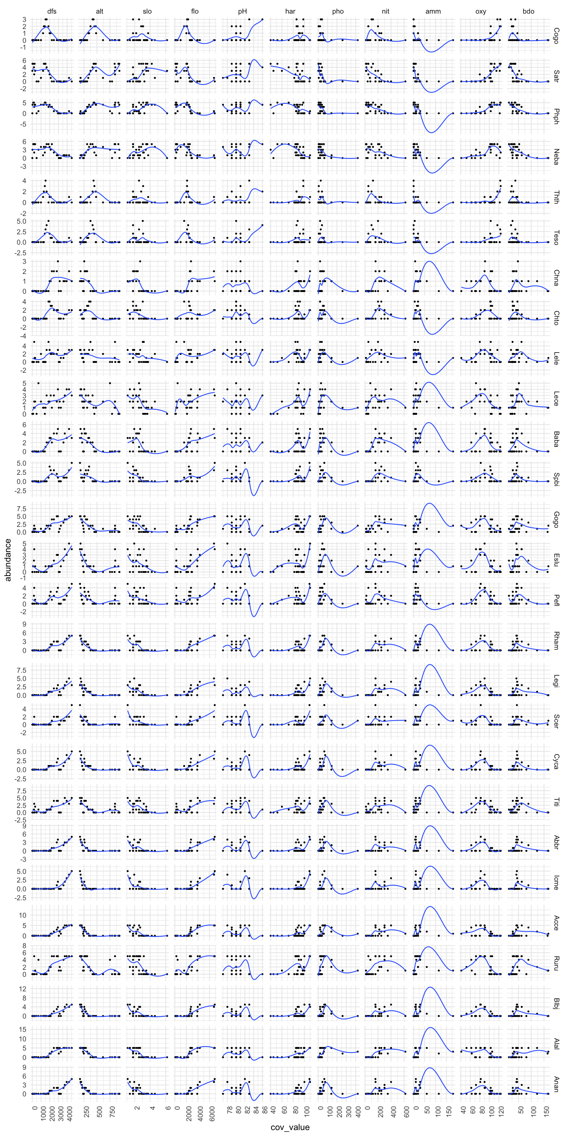
7.1 Implications
We can see that although there is a lot of information here, there are some clear types of behaviour for abundance ~ covariate. For example, species abundance typically reduces as altitude increases, for all species types. If we look at dfs (distance from source), we can see that there are some species that have peak abundnace midstream (Cogo and Thth), where as most other species have maximum abundance downstream, at the mouth of the river. Note that this general approach doesn’t work for every pairwise association. For example, the generalised approach of using a loess fit for amm and abundance clearly isn’t very good.
8 Discussion
Undertaking a number of steps to explore and understand the statistical properties of a data set prior to undertaking any detailed statiscally modelling work, could greatly improve the scientific results of a study. A standard protocol, where relevant, can be adopted as outlined in this vignette in order to do ths.
9 References
Zuur AF, Leno EN, Elphick CS (2010) A protocol for data exploration to avoid common statistical problems. Methods in Ecology and Evolution↩
Verneaux, J. (1973) Cours d’eau de Franche-Comté (Massif du Jura). Recherches écologiques sur le réseau hydrographique du Doubs. Essai de biotypologie. Thèse d’état, Besançon. 1–257. Doubs river fish communities. https://www.davidzeleny.net/anadat-r/doku.php/en:data:doubs↩
European Environment Agency, Freshwater quality. https://www.eea.europa.eu/data-and-maps/indicators/freshwater-quality/freshwater-quality-assessment-published-may-2↩